StockX Data Contest 2019
StockX Challenge is a call for data and sneakers nerds to have fun.

source: stockX
The basic idea is this: they give you a bunch of original StockX sneaker data, then you crunch the numbers and come up with the coolest, smartest, most compelling story you can tell. It can be literally anything you want. A theory, an insight, even just a really original data visualization. It could be a novel hypothesis about resale prices you’ve always wanted to test. Or maybe it’s just a beautiful chart to visualize the data. It can be on any subject – sneakers, brands, buyers, or even StockX itself. Whatever you find interesting, just follow your bliss.
I also gave a shot on trying to come up with something useful. Below is my finished data dashboard.
My Data Dashboard for StockX
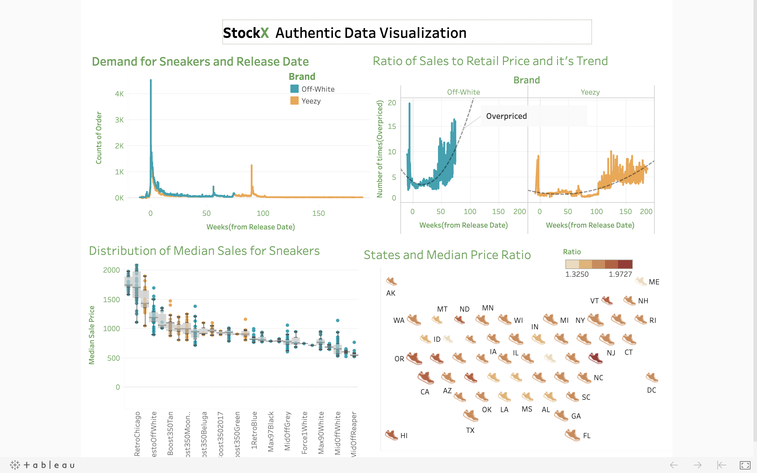
Dashboard
The link for tableau worksheet is here
Calculations on the Dashboards
Price ratio: Ratio of Sales to Retail Price for Each Sneakers
Weeks: (Order Date - Release Date) Converted in Weeks.
Median Price ratio is chosen to eliminate the effect of asymmetrical range of dates(2017-2019 not
complete as 2018) and counts of sneakers sales.
Color Scale for two brands are consistent whenever there is plot relating to brands.
1) Order of Sneakers by brand for weeks from Release Date
This plot shows the total count of orders for different sneakers of two brands Both Brands are ordered before the release date. Off white has more orders than yeezy on the datasets.
It’s interesting how the demand of yeezy increased at around 90 weeks after the release of the shoes.
2)Ratio of Sales Price to Retail Price For each Brand by Weeks
This plot look at the relation of ratio of sale price to retail price for each brands and weeks after release
date. Clearly,Both Brand’s sale price is more than the retail price. The ratio of off-White increases in
general regardless of the individual sneakers while the ratio of yeezy brands is somewhat noisy but it has
a trend like off white. Both brand’s price ratio is increased after the release date.
3)Distribution of Median Sales price given the retail price for each brand
This plot looks in detail on how the median sale price is distributed for each sneaker. The distribution of
median sale price for top 28 sneakers which were sold as least as 5 times over retail price are plotted.
4) Median Price and States
This plot is looking at the median price ratio for all the states. The color scale is chosen for the ratio and the size of the sneakers shows total sales relative to others. Which states usually pays more for sneakers? Clearly, Delaware,Vermont,Utah had some sales with high price ratio. States like California and Newyork have a lot of sales as shown by their relative sizes. The relative size is calculated by taking the log of total sales in each states. States like Wyoming have less Sales and also with lower sales ratio.