Visually Classifying Bacteria and Antibiotics
After World War II, antibiotics earned the moniker “wonder drugs” for quickly treating previously-incurable diseases. Data was gathered to determine which drug worked best for each bacterial infection. Comparing drug performance was an enormous aid for practitioners and scientists alike. In the fall of 1951, Will Burtin published a graph showing the effectiveness of three popular antibiotics on 16 different bacteria, measured in terms of minimum inhibitory concentration.

image creidt: Ask a biologist
I am reproducing this wonderful visualization from my professor( Silas Bergen.) in ggplot2, who did this in Tableau
Let’s bring the datasets,
library(tidyverse)
library(knitr)
library(kableExtra)
df <- read.csv("https://cdn.rawgit.com/plotly/datasets/5360f5cd/Antibiotics.csv", stringsAsFactors = F)
#String as Factors is a demon. Better not bring it here ! We rarely need that beast.
#There are 16 bacteria so giving them ID to reference later..
df<-df %>% mutate(ID =seq(1:16) )
kable(head(df,n = 16))| Bacteria | Penicillin | Streptomycin | Neomycin | Gram | ID |
|---|---|---|---|---|---|
| Mycobacterium tuberculosis | 800.000 | 5.00 | 2.000 | negative | 1 |
| Salmonella schottmuelleri | 10.000 | 0.80 | 0.090 | negative | 2 |
| Proteus vulgaris | 3.000 | 0.10 | 0.100 | negative | 3 |
| Klebsiella pneumoniae | 850.000 | 1.20 | 1.000 | negative | 4 |
| Brucella abortus | 1.000 | 2.00 | 0.020 | negative | 5 |
| Pseudomonas aeruginosa | 850.000 | 2.00 | 0.400 | negative | 6 |
| Escherichia coli | 100.000 | 0.40 | 0.100 | negative | 7 |
| Salmonella (Eberthella) typhosa | 1.000 | 0.40 | 0.008 | negative | 8 |
| Aerobacter aerogenes | 870.000 | 1.00 | 1.600 | negative | 9 |
| Brucella antracis | 0.001 | 0.01 | 0.007 | positive | 10 |
| Streptococcus fecalis | 1.000 | 1.00 | 0.100 | positive | 11 |
| Staphylococcus aureus | 0.030 | 0.03 | 0.001 | positive | 12 |
| Staphylococcus albus | 0.007 | 0.10 | 0.001 | positive | 13 |
| Streptococcus hemolyticus | 0.001 | 14.00 | 10.000 | positive | 14 |
| Streptococcus viridans | 0.005 | 10.00 | 40.000 | positive | 15 |
| Diplococcus pneumoniae | 0.005 | 11.00 | 10.000 | positive | 16 |
Before proceeding further with the data manipulation we need to think about the format of the visualization. Here we will be making our visualization on the bacteria level, that means we will have information for each bacteria, their gram stain , and the concentration of drug required .
If you look at the table above, we do have all the data we need but not on the format we are thinking. We want one information per row for each bacteria unlike above where each row has all the information of each bacteria on one single row. Let’s change the format of the data,
key_value = df %>% gather("Drug","Concentration",Penicillin:Neomycin,-Bacteria)
kable(head(key_value))| Bacteria | Gram | ID | Drug | Concentration |
|---|---|---|---|---|
| Mycobacterium tuberculosis | negative | 1 | Penicillin | 800 |
| Salmonella schottmuelleri | negative | 2 | Penicillin | 10 |
| Proteus vulgaris | negative | 3 | Penicillin | 3 |
| Klebsiella pneumoniae | negative | 4 | Penicillin | 850 |
| Brucella abortus | negative | 5 | Penicillin | 1 |
| Pseudomonas aeruginosa | negative | 6 | Penicillin | 850 |
okay so, now what we need to do is add a minimum concentration information for each bacteria for each stain type. so basically a column on the gathered table above. The only thing to keep note of is that here we should group all these bacteria and select the minimum concentration. We could have done this first[basically for eacg ] and gather like above but this is my thought process.
df_min<- key_value  %>%
  group_by(Bacteria) %>% summarise(Min = min(Concentration))
kable(head(df_min))| Bacteria | Min |
|---|---|
| Aerobacter aerogenes | 1.000 |
| Brucella abortus | 0.020 |
| Brucella antracis | 0.001 |
| Diplococcus pneumoniae | 0.005 |
| Escherichia coli | 0.100 |
| Klebsiella pneumoniae | 1.000 |
so now, let’s join this df_min dataframe from above with df to have that minimum information in the dataframe.
df<- inner_join(df,df_min,by = "Bacteria")
df<- df %>% mutate(Best = case_when(
  Penicillin == Min~ "Penicillin",
  Neomycin == Min~ "Neomycin",
  Streptomycin == Min~ "Streptomycin"
))
Now, since the data is ready and in the format we want,
kable(head(df))| Bacteria | Penicillin | Streptomycin | Neomycin | Gram | ID | Min | Best |
|---|---|---|---|---|---|---|---|
| Mycobacterium tuberculosis | 800 | 5.0 | 2.00 | negative | 1 | 2.00 | Neomycin |
| Salmonella schottmuelleri | 10 | 0.8 | 0.09 | negative | 2 | 0.09 | Neomycin |
| Proteus vulgaris | 3 | 0.1 | 0.10 | negative | 3 | 0.10 | Neomycin |
| Klebsiella pneumoniae | 850 | 1.2 | 1.00 | negative | 4 | 1.00 | Neomycin |
| Brucella abortus | 1 | 2.0 | 0.02 | negative | 5 | 0.02 | Neomycin |
| Pseudomonas aeruginosa | 850 | 2.0 | 0.40 | negative | 6 | 0.40 | Neomycin |
Okay, this step might be a little unintuitive but if we think with grammer of graphics philosophy this will make sense.
seq1 <- rep(1:16,each=100)
seq2 <-rep(seq(-6,6,length=100),16)
newdat <-data.frame(ID=seq1,T=seq2)
write.csv(newdat,"new_data.csv",row.names=FALSE)
We are making a new dataframe that has data point for the sigmoid curve(you can just draw sigmoid curve in R but this way it is linked with our data with ID)
#Joining the data by ID
final_df<-inner_join(df,newdat,by = "ID")
kable(head(final_df))| Bacteria | Penicillin | Streptomycin | Neomycin | Gram | ID | Min | Best | T |
|---|---|---|---|---|---|---|---|---|
| Mycobacterium tuberculosis | 800 | 5 | 2 | negative | 1 | 2 | Neomycin | -6.000000 |
| Mycobacterium tuberculosis | 800 | 5 | 2 | negative | 1 | 2 | Neomycin | -5.878788 |
| Mycobacterium tuberculosis | 800 | 5 | 2 | negative | 1 | 2 | Neomycin | -5.757576 |
| Mycobacterium tuberculosis | 800 | 5 | 2 | negative | 1 | 2 | Neomycin | -5.636364 |
| Mycobacterium tuberculosis | 800 | 5 | 2 | negative | 1 | 2 | Neomycin | -5.515151 |
| Mycobacterium tuberculosis | 800 | 5 | 2 | negative | 1 | 2 | Neomycin | -5.393939 |
#ggplot
final_df <- final_df %>% mutate(Sigmoid = 1/(1 + exp(-T)))
okay so now we have the final dataset, we can get in the ggplot2 land.
p <- ggplot(data = final_df , aes(x = T , y = Sigmoid ))
p + geom_point() 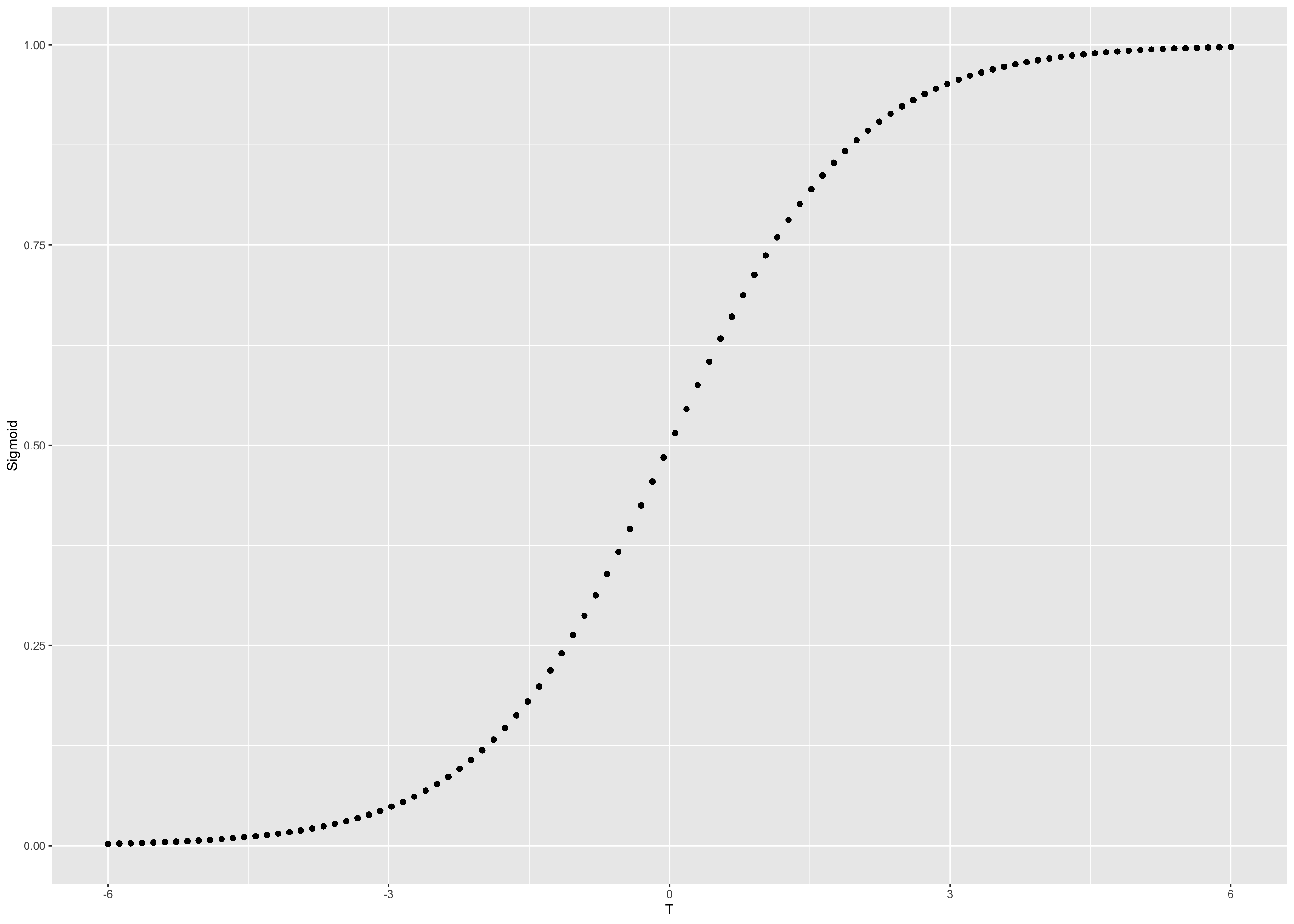
#Making best slope
#Different slop will separate our curves
final_df<-final_df %>% mutate(bestBacSlope = case_when(
  Best =="Streptomycin" ~ 4 - ID,
  Best =="Neomycin" ~ 9 - ID,
  Best =="Penicillin" ~ 14 - ID
))
final_df<-final_df %>% mutate(curveBest = ID + bestBacSlope * Sigmoid)
#Figuring out ID and labels
label_df<-final_df %>% dplyr::select(c(ID, Bacteria))%>% group_by(Bacteria,ID) %>% summarise(count = n()) %>% dplyr::select(Bacteria,ID) %>% arrange(ID)Below are the label we will use in y-axis
label_y= c("Mycobacterium tuberculosis" ,  "Salmonella schottmuelleri"  ,
           "Proteus vulgaris"        ,        "Klebsiella pneumoniae"  ,
           "Brucella abortus"      ,          "Pseudomonas aeruginosa"    ,
           "Escherichia coli"    ,            "Salmonella (Eberthella) typhosa",
           "Aerobacter aerogenes"     ,       "Brucella antracis"    ,
           "Streptococcus fecalis"    ,       "Staphylococcus aureus"      ,
           "Staphylococcus albus"    ,        "Streptococcus hemolyticus"      ,
           "Streptococcus viridans"    ,      "Diplococcus pneumoniae")
Now it’s a plotting time !
#Plotting the sigmoid plots
library(ggthemes)
## Warning: package 'ggthemes' was built under R version 3.5.2sankey <- ggplot(data = final_df, aes(x = T , y = curveBest, color =Gram,size = Min,alpha = 0.9,group = Bacteria)) + geom_line() +scale_fill_manual(values=c("green","red")) +
scale_y_continuous(breaks = seq(1:16) , labels = label_y) + theme(axis.title.y = element_blank() , axis.line.x = element_blank() , axis.ticks.x = element_blank(), axis.title.x =element_blank() , axis.text.x.bottom = element_blank() ) +
annotate("text", x = 6, y = 14, label = "Penicillin") +
annotate("text", x = 6, y = 9, label = "Neomycin") +
annotate("text", x = 6, y = 4, label = "Streptomycin") +
annotate("text",x = 5.5,y = 15,label = "Best Antibiotics" ,size = 5, colour = 'blue')+
theme_minimal()sankey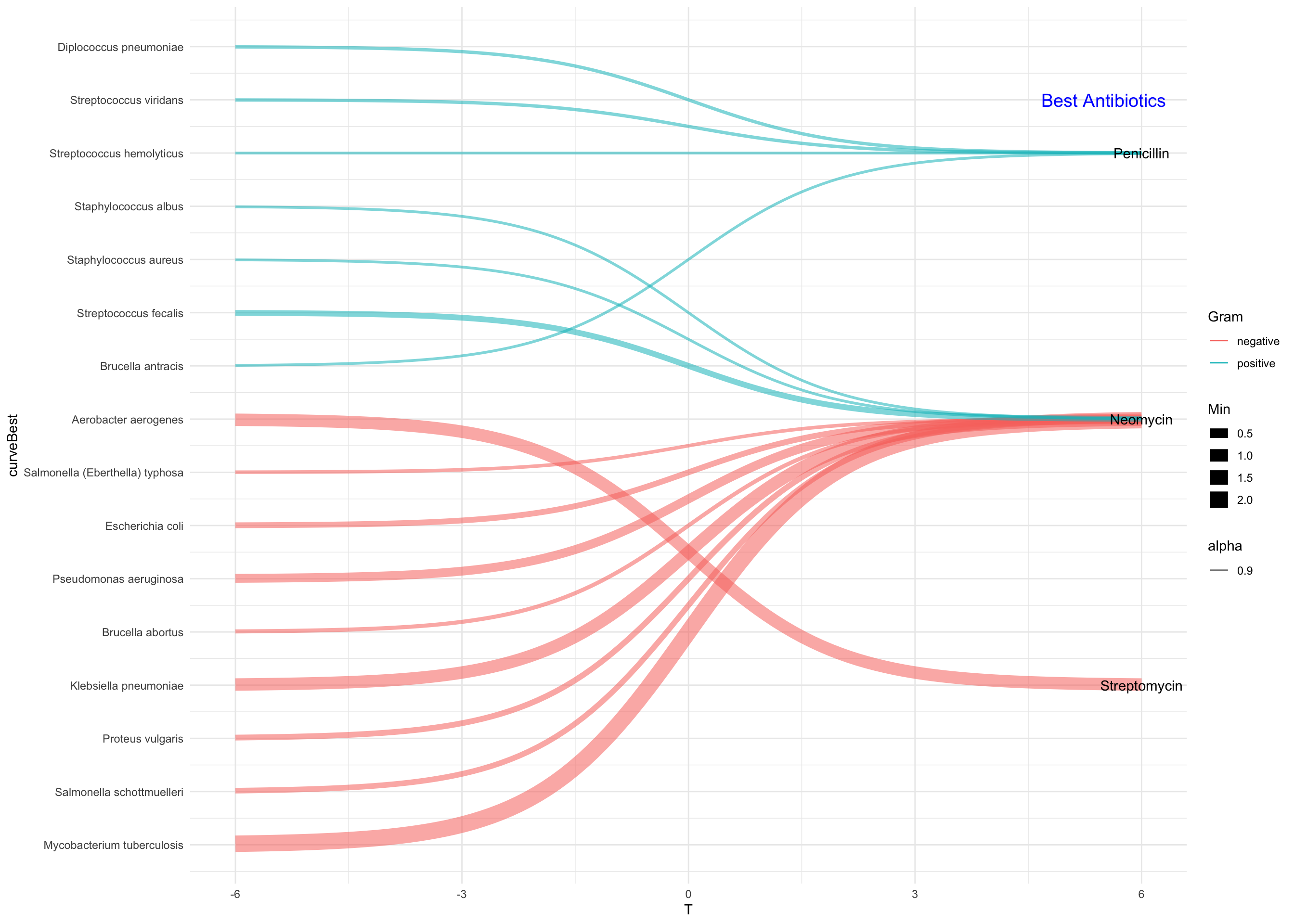
Figure 1: Classification of Bacteria